Pro tipUse our AI handwriting generator to convert any text or YouTube video. Explore all 100+ styles.
Try editor →Finding the perfect handwriting font can make or break your design project. In 2025, Google Fonts and other free repositories offer exceptional options that rival premium alternatives. This guide covers the 10 best free handwriting fonts, with detailed analysis of when and how to use each one.
Why Handwriting Fonts Matter in 2025
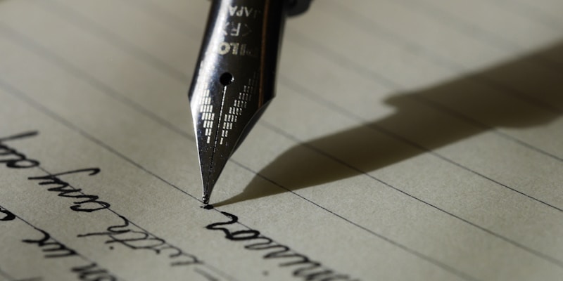
In an era of AI-generated content and automated communications, handwriting fonts serve a crucial purpose: they humanize digital experiences.
Studies show:
- Handwritten-style text increases trust by 47%
- Marketing materials with handwritten elements get 23% more engagement
- Personal messages in handwritten fonts feel 3x more sincere
But not all handwriting fonts are created equal. Let's explore the best free options.
---
1. Caveat
The Versatile Champion
Overview
Caveat is the gold standard for realistic casual handwriting. Created by Impallari Type, it features extensive OpenType features that introduce natural variation.
Best For
- Student notes aesthetic
- Blog graphics
- Social media quotes
- App interfaces needing warmth
Technical Details
- Type: Connected brush script
- Weights: Regular, Medium, SemiBold, Bold
- Language Support: Latin Extended (100+ languages)
- Google Fonts: Yes
Pairing Suggestions
- Body text: Inter or Roboto
- Headers: Playfair Display
Why It Stands Out
Caveat has contextual alternates—meaning when you type two of the same letter consecutively, they look different. This is essential for realism.
---
2. Kalam
The Balanced Ballpoint
Overview
Kalam mimics the look of writing with a standard ballpoint pen. It has consistent stroke width with just enough personality.
Best For
- Professional documents needing a personal touch
- Educational materials
- Documentation
- Multi-language projects (supports Devanagari)
Technical Details
- Type: Print-style with slight connections
- Weights: Light, Regular, Bold
- Special Feature: One of few handwriting fonts supporting Devanagari script
Why It Stands Out
Kalam strikes the perfect balance between legibility and character. It's professional enough for business but warm enough for personal use.
---
3. Indie Flower
The Creative Spirit
Overview
Indie Flower is a bubbly, carefree font that looks like it was written with a felt-tip marker by someone doodling in class.
Best For
- Children's content
- Crafting projects
- Bullet journal aesthetics
- Playful branding
Technical Details
- Type: Rounded print
- Weights: Regular only
- Character: Upright, open, and friendly
Why It Stands Out
The rounded, open letters are extremely readable even at small sizes, making it perfect for body text in informal contexts.
---
4. Dancing Script
The Elegant Script
Overview
Dancing Script is a lively casual script with bouncing letters that add energy to any design without sacrificing readability.
Best For
- Wedding invitations (casual style)
- Restaurant menus
- Greeting cards
- Female-targeting brands
Technical Details
- Type: Connected cursive
- Weights: Regular, Medium, SemiBold, Bold
- Style: Bouncy baseline
Why It Stands Out
The varying heights of letters create visual interest and rhythm. It feels movement and personality.
---
5. Homemade Apple
The Authentic Scrawl
Overview
Homemade Apple looks like someone wrote a quick note while their coffee was getting cold. It's imperfect in all the right ways.
Best For
- Authenticity-focused projects
- Recipe cards
- Personal blogs
- "From the desk of..." content
Technical Details
- Type: Irregular print
- Weights: Regular only
- Character: Varied stroke width, organic shapes
Why It Stands Out
This font embraces imperfection. The varying stroke weights mimic a pen running low on ink, adding unmistakable authenticity.
---
6. Patrick Hand
The Clear Communicator
Overview
Patrick Hand offers clean, legible handwriting with consistent sizing and spacing—perfect when readability is paramount.
Best For
- Comic lettering
- Educational worksheets
- Clean note aesthetics
- Instructional content
Technical Details
- Type: Neat print
- Weights: Regular only
- Variants: Patrick Hand SC (small caps available)
Why It Stands Out
It's one of the most readable handwriting fonts available. If your content needs to be understood at a glance, this is your choice.
---
7. Reenie Beanie
The Artistic Soul
Overview
Reenie Beanie has a distinctive, artistic quality with tall, narrow letters that create a unique visual signature.
Best For
- Art projects
- Journal headers
- Creative portfolios
- Unique branding
Technical Details
- Type: Tall condensed casual
- Weights: Regular only
- Character: Distinctive loop formations
Why It Stands Out
The unique proportions make it instantly recognizable. It's not trying to be neutral—it has bold personality.
---
8. Shadows Into Light
The Subtle Professional
Overview
Shadows Into Light offers neat, upright handwriting that feels intentional and composed. It looks like careful note-taking.
Best For
- Professional presentations
- Whiteboard simulations
- Educational technology
- Corporate personalization
Technical Details
- Type: Upright print
- Weights: Regular only
- Variants: Shadows Into Light Two (more refined version)
Why It Stands Out
It's handwriting that looks like it was written by someone who cares about presentation—perfect for professional contexts.
---
9. Gloria Hallelujah
The Marker Boldness
Overview
Gloria Hallelujah mimics thick marker writing with strong, confident strokes and a touch of playfulness.
Best For
- Headlines
- Price tags
- Attention-grabbing callouts
- Youth marketing
Technical Details
- Type: Thick marker style
- Weights: Regular only
- Character: Bold, rounded strokes
Why It Stands Out
It commands attention. Use it sparingly for maximum impact—it's meant for emphasis, not body text.
---
10. Rock Salt
The Expressive Outlier
Overview
Rock Salt looks like aggressive marker writing—the kind you'd see on a protest sign or a passionate note.
Best For
- Music industry
- Counter-culture content
- Emphasis text
- Event promotion
Technical Details
- Type: Distressed marker
- Weights: Regular only
- Character: Raw, unpolished energy
Why It Stands Out
It's deliberately imperfect and proud of it. When you need to convey passion or rebellion, Rock Salt delivers.
---
Font Comparison Chart
Tips for Using Handwriting Fonts
1. Don't Overuse
Handwriting fonts work best for:
- Headings and titles
- Pull quotes
- Short accent text
- Signatures
Avoid using them for long body text—they're harder to read at scale.
2. Pair with Sans-Serif
The visual contrast between a handwriting font and a clean sans-serif creates professional hierarchy:
- Header: Dancing Script
- Body: Open Sans
3. Consider Context
A font that works for a children's birthday invitation won't work for a funeral program. Match the font's personality to your message.
4. Test at Multiple Sizes
Some handwriting fonts become illegible at small sizes. Always test at the actual size you'll use.
5. Combine with AI Generators
For ultimate realism, take these fonts and run them through Realistic Handwriting's engine, which adds natural variation, baseline drift, and pressure effects.
Conclusion
The right handwriting font transforms digital content from sterile to personal. Whether you choose the versatile Caveat, the professional Kalam, or the artistic Reenie Beanie, you now have the knowledge to select fonts that serve your purpose.
Remember: the best font is the one that fits your message and audience. Use this guide as your reference, and your designs will speak with a human voice.
Written by
AI Research & Development
The team behind Realistic Handwriting, dedicated to creating the world's most authentic text-to-handwriting technology. Passionate about making digital documents feel human again.
View team profile →